
To add a custom component, simply add the "Code Embed" component and paste the component code below.
Note: you can easily search for the Code Embed block with Ctrl + E to open the search bar.

Slider
data-type="analog"
The slider component in this example is set to a range of -48 to +12 to accomodate DSP programming. The default value is set to -48, with a step increment of 3dB.
<input type="range"
class="simple-slider"
min="-48"
max="12"
value="-48"
step="3"
list="gain-ticks">
<!-- step set to 3 dB increments -->

<!-- show dB level text-->
<datalist id="gain-ticks">
  <option value="-48" label="-48"></option>
  <option value="-36" label="-36"></option>
  <option value="-24" label="-24"></option>
  <option value="-12" label="-12"></option>
  <option value="0"   label="0"></option>
  <option value="12"  label="+12"></option>
</datalist>

<!--  dB ticks js-->
<style>
.simple-slider {
  width: 80%; /* wider for clarity */
}
</style>


<style>
.simple-slider {
  -webkit-appearance: auto;
  appearance: auto;
  width: 10%;
  height: 6px;
  background: #ccc;
  border-radius: 3px; /* round edges */
}
.simple-slider::-webkit-slider-thumb {
  -webkit-appearance: auto;
  width: 20px; height: 20px;
  background: #000;
  border-radius: 50%; /* cicle */
}
.simple-slider::-moz-range-thumb {
  width: 20px; height: 20px;
  background: #000;
  border-radius: 50%; /* circle */
  border: none;
}
</style>
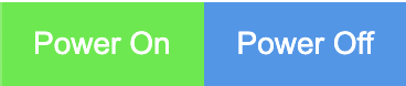
Button
data-type="digital"
data-id=<uniqueId>
To add a button, simply use the default button element. Search for the button elements with Ctrl + E.
Tab or window system
data-nav="windowName"
Button to unhide window:
data-target="windowNameToTrigger"